Reimagining the Life is Strange Episode Selection Menu
Reimagining the Life is Strange Episode Selection Menu and Prototyping my own!

Overview
Life is Strange follows Max Caulfield, a young photographer who discovers her ability to rewind time. For this project, I reimagined the episode‑selection menu with the goal of strengthening the player’s emotional connection to the narrative. Photography plays a big role for the main character, so I really wanted to lean into that aspect to set the tone of the selection menu while creating a more emotionally resonant entry point into each episode.
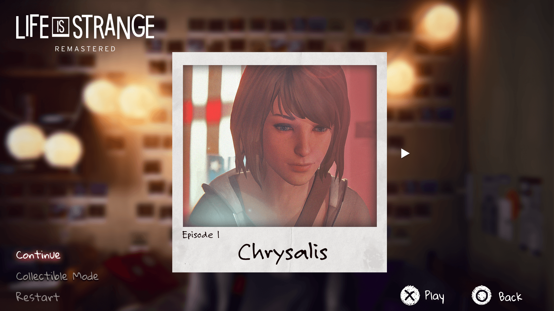
Final prototype
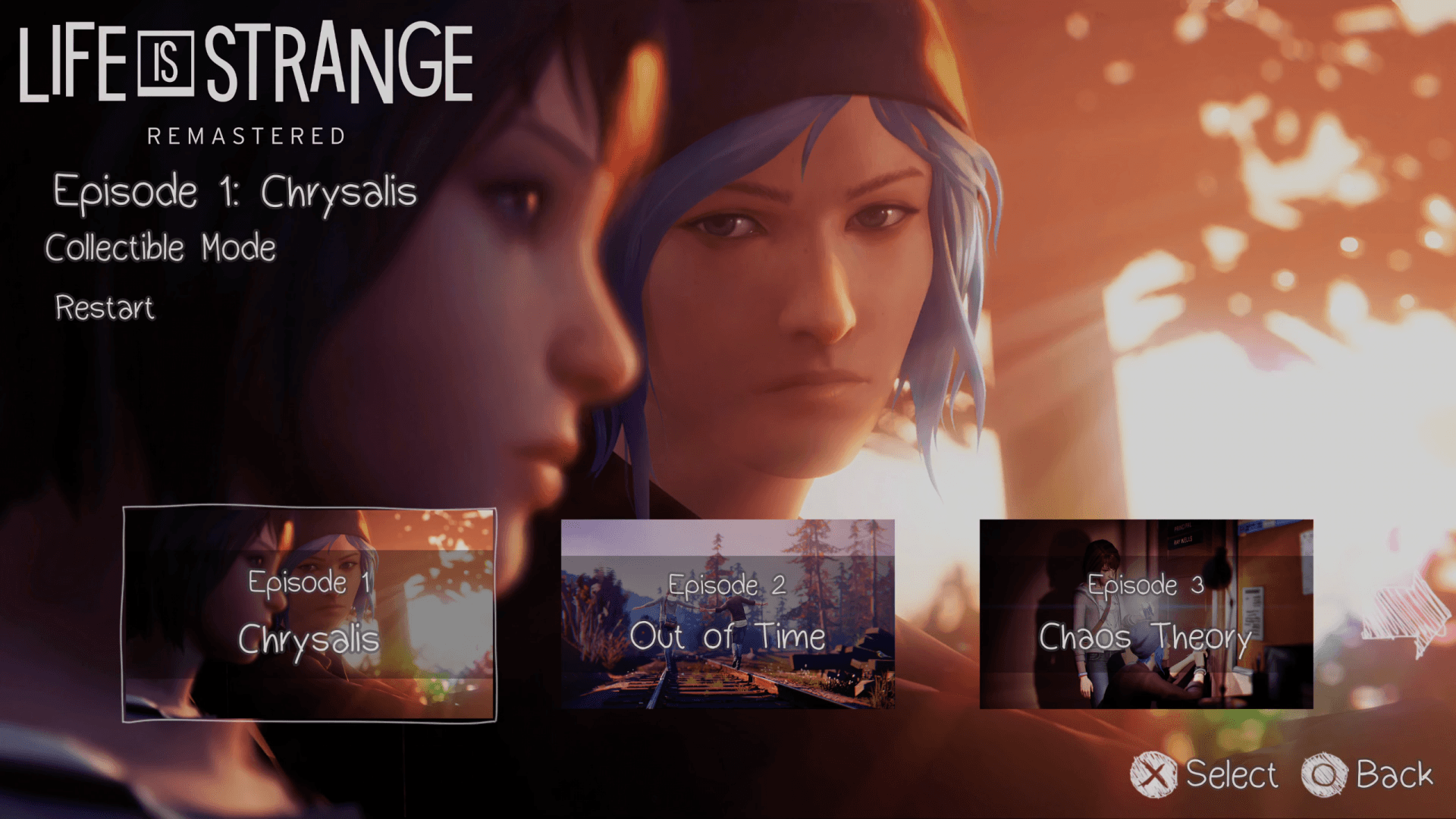
Analyzing original menu
The original design of this screen showcases episodes in a horizonal tile, by enlarging the photo showcased on the tile to be part of the main background. A scribbled up arrow is presented towards the right of the last tile to indicate there are more tiles to view.
Design Process
While concepting out a redesign of this screen, I didn’t want to create an entirely new theme. Instead, I wanted to reconstruct the way the player cycles through each episode, by introducing a special touch to it...
Goals:
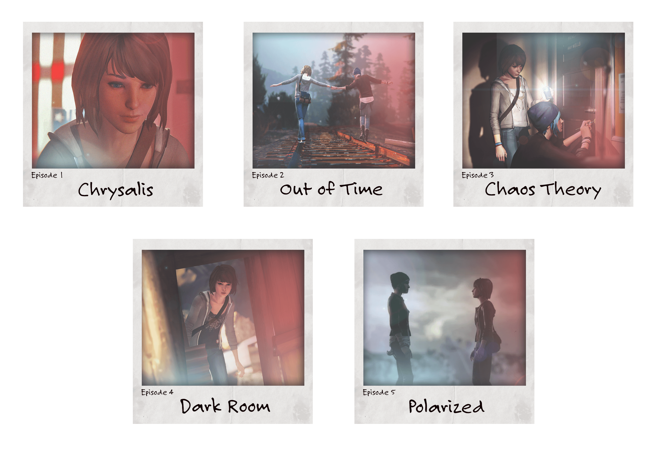
Showcase only one episode tile at a time to create curiosity and retain focus on element.
Encompass each episode to reflect a polaroid of episode preview.
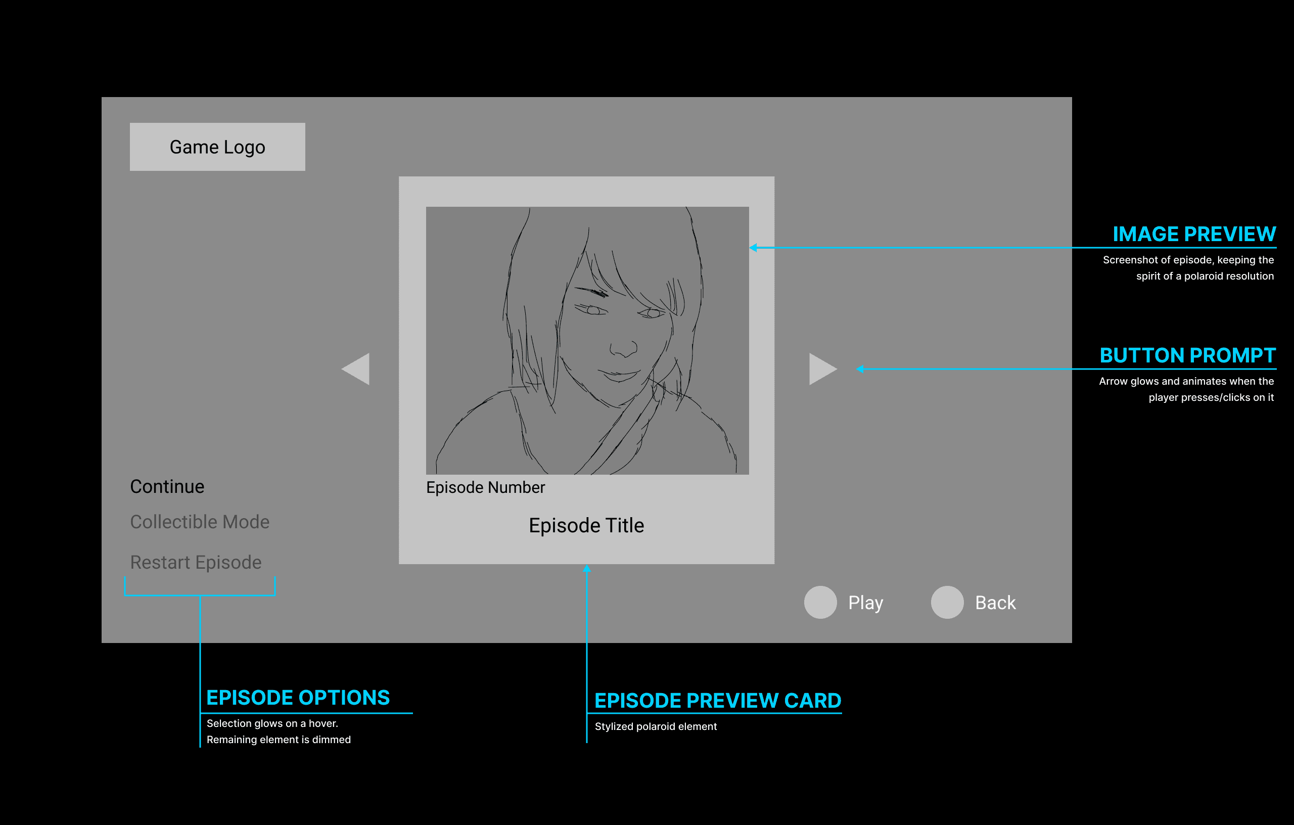
Episode Tile Stylization
For the episode cards, I made sure to include the following elements to give it more character:
Film grain
Paper texture
Lens Flare
Sharpie marking for episode and title
While keeping these elements in mind, visually it made a huge difference. I want the player to feel connected to them and excited to explore what more this photo has to offer. I want the player scrolling through these photos asking themselves the following questions;
What secrets are behind it? How does it begin? Where does it end? What moment in the story was this taken place?
Visual Design
When I am designing menu systems, I like to boosts it’s personality through the UI. Stylization is important, but I wanted to ensure I was evoking feelings into my design. To create a a more personal connection to Max, I went ahead and included Max’s room in the background which showcases her wall of photos. As you cycle through each episode card, it’s almost like the player is in Max’s room going through her polaroid captures.
Reflection
Evoking curiosity and excited for what comes next was my ultimate goal when redesigning this menu. Menu systems can do more than just provide information. They can express personality and help the player become more connected to the world you’re trying to build. As a designer, it’s important to me that I am creating an immersive world not just through gameplay, but through every aspect of the game.
Through every step into my design process, I ensure I am ALWAYS keeping the player in mind and asking myself questions on how they might process the visuals and information presented to them.